Pantone and the 2020 Color of the Year
Pantone has announced its Color of the Year for 2020, which is Classic Blue, “a timeless and enduring blue” that’s “suggestive of the sky at dusk,” according to the Pantone website.
Turns out, the simple color – a rich, dark blue – is a favorite of many interior designers for its versatility.
Keep reading for inspiration from renowned designers for your next remodeling project, from bold blue kitchen cabinets to area rugs in the elegant hue.
About the Pantone Company
Pantone is a limited liability company with headquarters in New Jersey. However, things did not start in New Jersey. Mervin and Jesse Levine started the company in New York in the 1950s. The company was created to be the commercial printing company of M & J Levine advertising.
The company took a turn when Lawrence Herbert was hired. Herbert started running the ink and printing division of the company. He led the division with so much profit that he eventually bought the company from Mervin and Jesse. He then renamed the company “Pantone”.
Today, Pantone is mostly known because of its Pantone Matching System (PMS). The Pantone Matching System is used primarily by design company as a proprietary color space. The matching system as the name suggests allows designers to match different colors together to see how well they match.
This helps the designers to know what color combinations to use for their different products. The PMS is bought annually so that the colors remain fresh and less tainted. Since 2000, Pantone has named a specific color “Color of the year”.
Here is a list of the colors that have been named “Color of the year” in the past:
Cerulean in 2000, Fuchsia Rose in 2001, True Red in 2002, Aqua Sky in 2003, Tigerlily in 2004, Blue Turquoise in 2005, Sand Dollar in 2006, Chili Pepper in 2007, Blue Iris in 2008, Mimosa in 2009, Turquoise in 2010, Honeysuckle in 2011, Tangerine Tango in 2012, Emerald in 2013, Radiant Orchid in 2014, Marsala in 2015, Rose Quartz in 2016, Greenery in 2017, Ultra Violet in 2018, Living Coral in 2019 and finally Classic Blue in 2020.
Each year, color company Pantone selects a Color of the Year based on the current events and trends happening in fashion, culture and so on.
Insights from the Professionals
Interior designers recommended adding Classic Blue to a room in the form of a large piece of furniture, such as a statement-making couch.
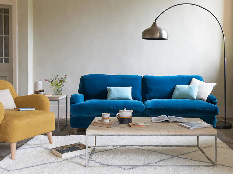
In an interview with Insider, Caitlin Murray, founder and designer at Black Lacquer Design in Los Angeles, had this to say: “I’m a fan of incorporating the shade by way of large furniture pieces, especially a supple velvet sofa.”
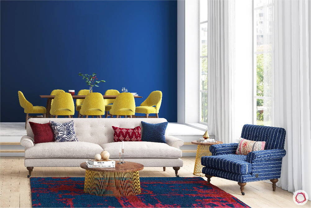
Classic Blue can also make for an eye-catching accent wall.
Jared Epps, CEO, and owner at JSE Design in Brooklyn, New York, says that he often uses dark blue as an accent paint color, but that he’s also used it as the main color for space — it just depends on the type or size of the room.
“I once used the color on all the walls of a home office, and it gave it a really rich look,” Epps said. “But for a bedroom or living space, I would say it’s better as an accent color.”
A Classic Blue-painted vanity can add interest to an otherwise neutral bathroom.
Founder and principal designer Ashley Moore at Moore House Interiors in Tomball, Texas, designed this bathroom space with dark-blue cabinetry.
“I’ve always believed that blue is a neutral and am excited to see this be the color for 2020,” Moore said. “Whether a kitchen island or a bathroom vanity to wet bar cabinets, Classic Blue can be used in a variety of ways.”
A fresh coat of paint in the dark-blue hue can also spice up kitchen cabinets and built-in storage.
Murray used a Classic Blue-inspired paint color on kitchen cabinetry in the space pictured above, pairing the primary color with a luxurious black-and-white countertop and metallic accents.
“Any space can benefit from a pop of this primary hue,” Murray said.
An area rug in the rich blue color can pull together an open-concept space.
Interior designer Jared Epps also suggested textured rugs as a way to add a touch of the rich color into your living space.
“I always say that when people are inspired by one single color, they should play around with different textures and materials of that same shade,” he said.
Classic Blue doesn’t have to be the only “pop” of color in the room, designers said.
“I think people shouldn’t be afraid of it, even though it’s such a rich shade,” Epps said.
Designers also said that Classic Blue can brighten a room in the form of pillows, vases, and kitchenware — all in the same bold color.
“I love using Classic Blue in throw pillows, especially against a leather couch, and incorporating vases, rugs, throw blankets, and even kitchenware with blue details,” said Moore.
Maggie Griffin, founder, and lead designer at Maggie Griffin Design recommended browsing antique malls and second-hand shops for various shades of Classic Blue.
“Try hanging a pretty wall of plates in your kitchen, sprinkling a few around on bookshelves, or even placing a vase on your nightstand,” Griffin added. Take it from the experts and embrace the classic foundation that is Classic Blue.